Category Archives: PowerPoint

Field Artillery Map Symbols Here – All 355 of Them!


As part of the Beta project that we are running with the Army’s Combined Arms Center and the USMC Training and Education Command I will be cranking out military graphics library packages nearly every day for the next 30 days. I hope to average +100 new images a day. Today’s installment is 355 Field Artillery Map Symbols.

Enjoy,

DK


The Science behind MPM – The Picture Superiority Effect


Visual communications are here to stay!  Don’t take my word for it, here is the scientific data.

  • People will remember 10% of what you say to them three days later.
  • If you communicate primarily with visuals (such as PowerPoint slides), your audience will remember 35% of what you show them.  That is three times as much.
  • If you use both visuals and spoken, they will remember 65% of what you have said/shown them.  That is over six times as much as just spoken.

Or so asserts one of my favorite brain researchers, Dr. John Medina

The underlying reason behind this astounding set of statistics is that human being’s dominant sense is visual and it trumps all other senses. 

Our earliest recorded forms of communications were cave drawings. 

As children, vision is our primary sense and spoken language develops later.

All of this wraps up into a theory called the Picture Superiority Effect.

What is the Picture Superiority Effect and How Does MPM Use It?

Simply put, the Picture Superiority Effect is the scientific explanation for why a picture is worth ten thousand words. 

For a little over 40 years, scientists have acknowledged that we encode memory “verbally” AND  “visually”.  This dual-coding theory says that people, when they are processing information (such as your presentation) break that information up and encode it in the two different stores of Visual and Verbal. 

Recent cognitive neuroscience suggests that the visual memory storage is the dominant one.  (Note:  all of you cognitive neuroscientists out there please excuse this oversimplification).   This because it is easier for people to recall visual information.  Period

So what does this all have to do with the Modern Presentation Method?  Well, everything really.  One of the underlying principles of MPM is that visual communication is here to stay.  And that if a presenter wants to be truly effective they need to tap into visual communication.

We help you tap into it in a number of ways.


Removing the Visual Design Barrier

First, through the use of super templates, design guides, and slide starters MPM absolves the presenter of the need to have basic design skills.  Take this example, the Decision Briefing Infographic.  It’s designed to be printed out on 11×17 paper.

Now, people who natively speak and read Indo-European languages scan across any visual in a Z-pattern.  And so this particular Modern Presentation Method is designed to take advantage of this fact.

This notion of absolving the presenter from needing to understand basic design principles is sprinkled throughout the MPM templates.  Background colors and text are color coordinated to be visually appealing and also to contrast where important information needs to pop.  Slide layouts take advantage of any of a wide variety of design principles such as the Rule of Thirds.

Removing the Graphics Barrier

Next, MPM removes the graphics barrier.  By putting several thousand high-quality organizationally focused graphics at the presenter’s fingertips, we remove the need to search for and chose quality graphics.

Text First, Visuals Second

Last, MPM takes advantage of most people native communications strength, the ability to write.  By having presenters put their story together in textual format first, we use that native ability.  Then once the 80% textual story is in place, we use the templates and graphics library to quickly move the presenter through the visual stage of the build process.

Summary

So that’s it.  People’s dominant sense is vision and the Picture Superiority Effect proves this.  MPM helps the presenter take advantage of the Picture Superiority Effect by removing the Visual Design and Graphics barriers, and by focusing their story building skills in Text First.

That’s all, thanks for tuning in.

 DK

mailto:dkarle@microsoft.com


Super White Template Has Arrived!!


Here you go!   Super_White_Template


Break the Glass Ceiling – 52 Glass Shapes To Use in Your Next Presentation


In an earlier post this week, I talked about the need for organizations to have a single Graphics Library that contains amongst other things, Shapes.  The primitives are circles, squares,rectangles, bullets, triangles, etc…

Today, I am including 52 different PNG files that have a range of shapes.  I call this type of shape Glass as the shapes themselves look like clear glass.  This is THE MOST COMMON type of shape that I use as it is very subtle.  Here is an example of three Glass Rectangles placed on a slide.

With PowerPoint, you can easily create shapes, but one of the lessons I have learned over the course of 1000 presentations is that having a library of pre-configured (color, size, border, perspective) shapes, saved as raster pictures files is a huge time saver. It takes me far less time took up a file than it takes to re-build them every time I need one.  To do this I create the shape I want in PowerPoint and then save it as a .png file. So, here are 52 Glass Shapes for you to use in a .zip file on my Tech Net site.  (Sorry, no .zip’s in WordPress)

That’s all, thanks for tuning in.

DK

mailto:dkarle@microsoft.com


The Modern Presentation Method Guiding Principles


So what are the principles that underlie the Modern Presentation Method?  What key tenets do I think should guide a presentation method?

Less Is More – A presentation should be of limited length and duration.  The goal is to present the right amount of information in the minimum time.

Standardize and Centralize to Save Time and Improve Quality – Standardize as much of the build process as possible via templates, an organizational graphics library, etc… and reduce the burden on the presenter.  Give them the 70% solution AND THEN let them customize.

Use The Right Tool – PowerPoint is only one of the tools a presenter should use.  Word, Excel, a Whiteboard, a Map Overlay, etc. are all valid alternatives or should be used in conjunction.

Have a Page 2 – If you present on the screen, keep it simple and clear, but keep the details (the Page 2) in the slide notes or appendix.

Dialogue is King – Most presentations are about understanding a situation or driving decisions.  With the exception of Mission presentations, 2-way dialogue should be a focus in every presentation.

Presentation Type Is Critical – There are three types of presentations.  They are (1) Pitching/Leading, (2) Organizing, (3) Teaching.  Use the right one for the right situation.

Outline Before You Build – The first step in any presentation is to figure out what you are trying to say.  Your first stop is the Whiteboard, not PowerPoint so you can get the right goals on paper and the right outline.

A Presentation Drives Action – Every good presentation should drive actions.  Period.

A Presentation Is Based on Goals – Every good presentation has specific goals that are derived from what the briefer is trying to accomplish and what the audience needs.  These must be defined up front.

Visual Presenting Is Here To Stay – Presenters must be competent in Text AND Visual.  Today, most are only competent in text.  This means new training and new techniques for the presenter.

Collaborate or Die – Groups & Teams need common repositories to share information.

Fast or Deliberate – A good presentation method supports the creation of a presentation in a rushed or hasty manner for those last minute fire drills. It also supports creating a presentation is a slower, deliberate manner.  The core steps are the same for both, what differs is how rigorously you apply each of the core steps.

Cradle To Grave – A good presentation method works for junior presenters as well as senior presenters.  This way, presenters only need to learn it once and they can reuse it (albeit with increasing complexity) throughout their careers.

There Is No Substitute For Good Training – Technical proficiency is one of the cornerstones for all high performance individuals and teams.   Today’s presenters receive no training.  This must be fixed!

That’s all, thanks for tuning in.

DK

mailto:dkarle@microsoft.com


New Super Green Template – Download it!


All right, it’s Template Thursday.  Today’s Super_Green_Template (Super_Green_Template_vfinal) is great for Pitching or Teaching and has a nice green color scheme.  Steal this and use it for your next presentation.  Let me introduce you to one of the slide layouts in this template.  It’s called the TrendWall.

Trend Wall

A TrendWall is a layout I like to use when I need to tell a complicated story.  In this case, I am using the TrendWall Layout to illustrate my background.  It is a virtual resume of everything I have done post-college.  I often use this layout as a slide where I introduce myself to an audience.


When I show this, the pictures themselves prompt me to tell my story which revolves around my family, my time in the Army, and my time at Microsoft.  Audiences love it, because it is so rich in detail and really helps me connect with the audience.

I have also used TrendWall’s to illustrate complicated problems.  You can use it to hold example photos of the problem at hand.

I have included three different TrendWall layout sets in the template.  Each has individual layouts for 1, 2, 3, 4, 6, 8, 9, 10, 12, and even 15 pictures. 

More on the other layouts in this template in later posts. 

Thanks for tuning in.

 DK

mailto:dkarle@microsoft.com


Introducing Your Organization to the Modern Presentation Method


Change is hard!  Especially within an organization.  People are afraid to move from what is familiar, even if it is sub-optimal, to something that is unfamiliar.  People have been emailing me lately asking how they should introduce the Modern Presentation Method into their organizations.  My answer is simple.  Do it very slowly.  Find the low hanging fruit.  And then fix it.

I recommend you find a presentation that is given regularly in your organization.  Something that is repeated frequently.  Here are some examples.

  • Sellers and Marketers:  Your core “pitch deck”.  The one you use whenever you are presenting on screen to prospective customers.
  • Teachers:  Any class you teach frequently.  Just pick one that looks bad or is too long.
  • Managers and Organizers:  All-Hands meeting.  Team or Project Status meeting.


The next time you need to do that presentation, create a second version of it using the Modern Presentation Method.  Then, when you are reviewing it beforehand with the stakeholders, show them   the before and after versions.  If you did a good job, they will love the new version created with the Modern Presentation Method.

To put my money where my mouth is, I am going to do a before and after of an AAR deck for a training unit at one of the Joint Readiness Centers.  We’ll see if I can get permission to post it so I can show you what I did.

Thanks for tuning in.

 DK

mailto:dkarle@microsoft.com


Charts and Graphs


Today’s post will be a quick one.  These are for all of those people who are creating Pitch or Teaching presentations for onscreen or want a sharp on paper Organizing presentation.  Many times when you want to include a chart of a graph you can’t find one that looks clean enough in the standard chart templates.  Good charts and graphs are instantly understandable so they should be simple, with appropriate colors highlighting the important data, and with a minimum of text.

Well here are two in slide starters.  Blogs_and_Charts_v1

Doughnut Chart

The first is called a Doughnut Chart and it’s pretty self-explanatory.  I have made this one in grey scales so it will work with a large variety of backgrounds.  Multiple successive Doughnut Charts are great if you have one variable that are you are comparing over successive time periods such as year-to-year or quarter to quarter.


Pictorial Graphs

Pictorial Graphs are an even better method for single variable, successive time period comparisons.  The real advantage over Doughnut Charts is you use an icon or picture to represent the variable.  In this case, we could be talking about housing occupancy rates.  Again, simple, colors have meaning, and text is minimized.


Just a little taste, more to come in later posts.  Thanks for tuning in.

 DK

mailto:dkarle@microsoft.com


Rehearse or Die! (Step 4 of MPN Rehearse (and Refine) your Presentation)


We’ve spent the last few weeks going over Step 3 of the Modern Presentation Method:  Build and Refine.  Now it’s time to move on to the second to last step, Step 4:  Rehearse (and Refine).

At the end of Step 3:  Build and Refine, the goal was to have a presentation that meets your minimum quality bar and is ready to deliver.  Call this the 80% solution.  A solid B grade.

The end goal for Step 4: Rehearse (and Refine) is take that 80% presentation and turn it into a 99% presentation, an A+ if you will.  Along the way, not only does the presentation itself improve in quality, but so does the presenter.  The presenter learns how to adroitly deliver the presentation.


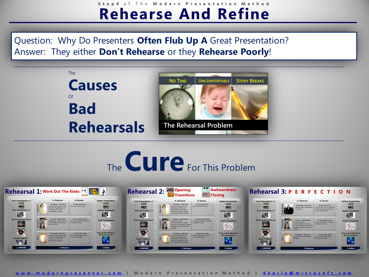
The Rehearsal Problem

Years ago, when I first started writing presentations I was struck by how often I observed a well-constructed presentation being poorly delivered by the presenter.  As I read up on the advice of great presentation experts and compared it to what I saw happening in the real world, a number of obstacles emerged that were the primary causes of this “great presentation – poor delivery” phenomenon.

  1. Presenters have very little rehearsal time.  In our fast-paced, real-time world, presenters often have precious little time to actually do rehearsals.  As a result, rehearsals often are not scheduled and if they are scheduled, they are often rushed.
  2. Rehearsing is uncomfortable.  No one, especially senior executives, likes to do a rehearsal and worse be critiqued.  Many of them will default to blaming the presentation rather than their own skills as a presenter for any awkwardness or poor passages during a rehearsal.   
  3. Presenters often break the story when they tweak it during rehearsals.  The process of improving a presentation is never-ending.  Edits, tweaks, and changes will be done up until literally the moment the presenter goes on stage.  The key is to make sure those changes enhance the story, not break it.

Over the course of a thousand presentations, I tried various strategies and ideas out to address these three road blacks.  Here are the solutions.


Schedule 3 Rehearsals and Drive a Quality Rehearsal in Each:

The experts will tell you to rehearse as many times as you can.  And they are right.  Except for the simple fact that most people have precious little time to do rehearsals.  I always encourage the speakers that I am working with to rehearse everywhere.  In the shower.  While they are sitting in meetings.  On the drive to and from work.  Etc…

But, and this is a big but, I always schedule 3 formal rehearsals.  Always!  Each one has a different purpose and desired outcome.


Rehearsal 1:  Get Out The Kinks:  In Rehearsal 1 the goal is two-fold.  Expose any egregious problems with the presentation AND make the presenter comfortable with the presentation. 

If I am the presenter, I will bring one person into the room to listen.  If someone else is the presenter, I will still bring in someone else to listen in.  That extra person gets a copy of the presentation on paper and is instructed to write down notes any time they see a problem.

Then the presenter simply drives through the entire presentation, beginning to end, without pause.  No one interrupts.  They will stumble often as the passage are uncomfortable and they are doing it for the first time.  But with you and the observer watching and noting the obvious problems on paper, every slip is captured. 

Once the presenter is done, the observer goes through each point in their notes.  Spelling errors, poor graphics, awkward passages, all of the “kinks” that still exists in the presentation are surfaced.  Then the presenter details their thoughts of what went well and what needs to be improved. 

In Rehearsal 1, unless there is a fatal flaw in the story, don’t make major changes in the presentation.  However, it is ok to move entire sections.  If your presentation has a section 1, 2, and 3, swapping 1 for 3 is ok.  But if you feel that the story is broken you have a major problem and probably need to go back to Build & Refine and rework your story. 

In a good review, you will only have small changes.  “This slide doesn’t look right”.  “You misspelled…”  “I don’t feel comfortable saying that.” “The order is a little off.”  This is good.  As soon as the rehearsal is over, fix the “kinks” and drop a copy of the presentation to both the observer and the presenter and ask them to make sure you did not miss anything.

The presenter will still feel uncomfortable with the presentation.  That is all right.  They did not write it so if you failed to capture their “voice” it was reflected in the draft that they practiced on.  The small changes you made will help evolve the presentation for them.


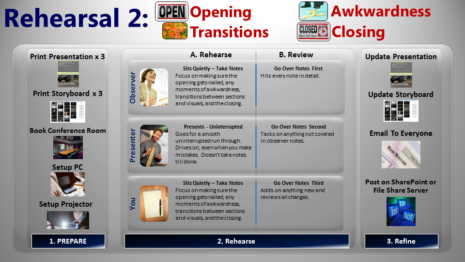
Rehearsal 2:  Opening, Closing, Transitions, and Story Tweaks:  This is the rehearsal where you take your deck from 80% to 99%.  Most likely, the presenter has had some time to internalize the story and will come to the table immediately with more small tweaks and changes.  Get them documented right away before you start. 

Take a few minutes and notate these new changes on the printed draft that the presenter is using for rehearsal.  Now bring in an observer.  This should not be the same person from Rehearsal 1. 

Have the presenter do an uninterrupted run though of the presentation.  You are looking for five things to take notes on:

  • Opening:  Did the presenter nail the first 90 seconds?  This should be written down verbatim in the script.  The opening does two things.  One, it gives the presenter 90 seconds of completely canned content which gets most people through the “adrenaline zone” and helps them settle down.  Two, it is the time you hook the audience with your powerful story.  It must be flawless.
  • Awkwardness:  Every presenter will have well written passages in the presentation that they have trouble with.  Find them and either rewrite them into the presenter’s “voice” or find a way to help the presenter become comfortable with them. 
  • Transitions:  There are two types of transitions in every visual presentation.  One, there are transitions from one visual to the next.  Most presenters butcher these by saying something like “and on the next slide”.  Instead, work with them to have elegant transitions that introduce each new visual as building the story you are trying to tell.  “You will see here a great example of what I was just talking about.  You see ACME company…”  The second transition is a section transition.  In every presentation, you are trying to drive home those door points.  Each one will be a different section.  Make sure you stop on the final slide for section 1, summarize it, and then go on to clearly introduce the next section. 
  • Story Flow:  The story should be flawless and make sense. 
  • Closing:  Just like in opening, this should be canned.  90 to 120 seconds of script written word for word.  We do this for two reasons.  One, if the presentation has gone well there is a tendency for the presenter to “race to the finish”.   A set script helps control that.  Second, you want to make sure you end on clear calls to action for the audience.  The entire purpose of your speech can be summed within these calls to action and it just makes sense to write them down clearly and succinctly.


End this rehearsal the same way.  The observer reports out his or her notes.  The presenter does the same.  You capture it all, make the edits, and resend the presentation to them to make sure you got it right.  The result is a 99% presentation.
   

Rehearsal 3:  The 99% Solution:  Now it is time for the final rehearsal.  There are two schools of thought about how to do this.  One school advocates bringing in a bunch of the stakeholders and let them see the final presentation.  The other school of thought is to do this rehearsal with just executive, in the actual presentation environment, with only a small group of stakeholders. 

I prefer the latter.  If I have done my due diligence during the first three steps of the Modern Presentation Method (Visualization, Storyboard, Build & Refine), the stakeholders have had many opportunities to weigh in on the presentation.  Inviting them to “review” the final presentation can often be a disaster.  Those stakeholders who got less than they wanted will often advocate, forcefully, one final time to get their content included.  The Good Idea Fairy, which looks less like a fairy and more like a cross between a fire-breathing dragon, a buzzard, and a velociraptor will fly around the room occasionally as well.  I subscribe to General George Patton’s advice at this stage of a presentation.  I paraphrase, “A good plan, perfectly executed is better than a perfect plan poorly executed”.  By this point you have built a good presentation, it’s time to deliver it with confidence.

In any case, we do the final rehearsal onsite.  The presenter comes in; perhaps a few key stakeholders are there (the senior PR person, the senior marketing person, maybe the speaker’s direct reports, and the production crew).  The presenter does the final run through, in its entirety, with videos and demos (including the actual demoer).  This is a full dress-rehearsal and no one interrupts. 

At the end, everyone huddles, puts in their two cents, the presenter and speechwriter explicitly agrees or disagrees with every change.  The changes are made and the final presentation is published.


Intelligently Improve the Presentation

There will be many edits during the rehearsal phase.  They will generically come in two forms.  Little and Major.

  • Little – Little edits are tweaks.  Spelling errors (which always happen).  Visuals need to be tweaked.  Videos need to be edited so they have more punch.  The script has poor passages that can be tightened up.  Transitions do not make sense. And the list goes on.  The key is that the edit is quick and easy to make and requires no surgery on either the underlying story.  If you add a slide, it’s only one or two and vice versa if you have to subtract a slide.
  • Major – Major is a completely different ball of wax.  As some point, the Good Idea Fairly (the cross of Fire-Breathing Dragon, Buzzard, and Velociraptor) descends upon your presentation and renders it limb from bloody limb.  The core door points change.  The story flow changes.  A completely new section is added that somehow does not fit in.  More than one or two slides are added or subtracted.   If this happens and it is the right thing to do (which it often is), you need to rush back to the Build & Refine Step and get it done quickly.  Every presentation must be built around a coherent story with good door points.  If you don’t do that, doom on you!


Summary

That is Rehearse (and Refine) in a nutshell.    I have done all three rehearsals in one sitting before.  I have also spread them out over several weeks.  In my experience, doing it this way will take that 80% deck and a presenter who is capable of delivering cold with a solid B grade as a result, make both the presenter and deck 99%, and result in an A+.    

You have to decide how important the presentation is.  If it is a garden-variety run of the mill presentation, just remember “B’s get degrees” and only do the first rehearsal.  If it is a game changer and might get you promoted, sell more of your product, or can result in something amazing, go for the A+ and do the three rehearsals. 
   

Thanks for tuning in.

 DK

mailto:dkarle@microsoft.com

Step 4:  Rehearse and Refine Poster


Presenter Tools – Part One


So first off, what software should you have?  Well for all presenters, Microsoft Office 2010 of course. 

I have found that for the majority of presentations, whether on screen or on paper, I will use PowerPoint, Word, and/or Excel at some point in the process.

PowerPoint, in addition to being a great on screen presentation tool, is even better for creating handouts during presentations.  Think of it as a blank canvas that you can use to mix and organize text, data, and graphics.  In fact one of the best practices I will be talking about in an upcoming post is how to use a single printed PowerPoint slides to help bring to life complex issues and scenarios.

Excel is the standard for pulling together data and showing it off.  I have also used it as the actual presentation tool many times.

Word is the tool I use to drive deep discussion.  It lends itself to deep intellectual exploration of key issues.  Almost 100% of the time I use Word at some point in the MPM process.

Now for those of you that are 200 and 300 level presenters I always recommend Microsoft Office 2010 as a core set of tools, but if you stay tuned for later posts I have some additional cool tools for you as well.

DK

mailto:dkarle@microsoft.com