Tag Archives: MPM

A Little Tease For Tomorrow


Hello everyone.  I’ve been off the grid working on a military map symbols set for the US Army Graphics Library.  If everything goes as planned we will have a test version of the library available in the next two weeks.

Also, tomorrow is template Thursday so I will have a new Super Template, this time in Green!

Check back tomorrow!

DK


Charts and Graphs


Today’s post will be a quick one.  These are for all of those people who are creating Pitch or Teaching presentations for onscreen or want a sharp on paper Organizing presentation.  Many times when you want to include a chart of a graph you can’t find one that looks clean enough in the standard chart templates.  Good charts and graphs are instantly understandable so they should be simple, with appropriate colors highlighting the important data, and with a minimum of text.

Well here are two in slide starters.  Blogs_and_Charts_v1

Doughnut Chart

The first is called a Doughnut Chart and it’s pretty self-explanatory.  I have made this one in grey scales so it will work with a large variety of backgrounds.  Multiple successive Doughnut Charts are great if you have one variable that are you are comparing over successive time periods such as year-to-year or quarter to quarter.


Pictorial Graphs

Pictorial Graphs are an even better method for single variable, successive time period comparisons.  The real advantage over Doughnut Charts is you use an icon or picture to represent the variable.  In this case, we could be talking about housing occupancy rates.  Again, simple, colors have meaning, and text is minimized.


Just a little taste, more to come in later posts.  Thanks for tuning in.

 DK

mailto:dkarle@microsoft.com


Rehearse or Die! (Step 4 of MPN Rehearse (and Refine) your Presentation)


We’ve spent the last few weeks going over Step 3 of the Modern Presentation Method:  Build and Refine.  Now it’s time to move on to the second to last step, Step 4:  Rehearse (and Refine).

At the end of Step 3:  Build and Refine, the goal was to have a presentation that meets your minimum quality bar and is ready to deliver.  Call this the 80% solution.  A solid B grade.

The end goal for Step 4: Rehearse (and Refine) is take that 80% presentation and turn it into a 99% presentation, an A+ if you will.  Along the way, not only does the presentation itself improve in quality, but so does the presenter.  The presenter learns how to adroitly deliver the presentation.


The Rehearsal Problem

Years ago, when I first started writing presentations I was struck by how often I observed a well-constructed presentation being poorly delivered by the presenter.  As I read up on the advice of great presentation experts and compared it to what I saw happening in the real world, a number of obstacles emerged that were the primary causes of this “great presentation – poor delivery” phenomenon.

  1. Presenters have very little rehearsal time.  In our fast-paced, real-time world, presenters often have precious little time to actually do rehearsals.  As a result, rehearsals often are not scheduled and if they are scheduled, they are often rushed.
  2. Rehearsing is uncomfortable.  No one, especially senior executives, likes to do a rehearsal and worse be critiqued.  Many of them will default to blaming the presentation rather than their own skills as a presenter for any awkwardness or poor passages during a rehearsal.   
  3. Presenters often break the story when they tweak it during rehearsals.  The process of improving a presentation is never-ending.  Edits, tweaks, and changes will be done up until literally the moment the presenter goes on stage.  The key is to make sure those changes enhance the story, not break it.

Over the course of a thousand presentations, I tried various strategies and ideas out to address these three road blacks.  Here are the solutions.


Schedule 3 Rehearsals and Drive a Quality Rehearsal in Each:

The experts will tell you to rehearse as many times as you can.  And they are right.  Except for the simple fact that most people have precious little time to do rehearsals.  I always encourage the speakers that I am working with to rehearse everywhere.  In the shower.  While they are sitting in meetings.  On the drive to and from work.  Etc…

But, and this is a big but, I always schedule 3 formal rehearsals.  Always!  Each one has a different purpose and desired outcome.


Rehearsal 1:  Get Out The Kinks:  In Rehearsal 1 the goal is two-fold.  Expose any egregious problems with the presentation AND make the presenter comfortable with the presentation. 

If I am the presenter, I will bring one person into the room to listen.  If someone else is the presenter, I will still bring in someone else to listen in.  That extra person gets a copy of the presentation on paper and is instructed to write down notes any time they see a problem.

Then the presenter simply drives through the entire presentation, beginning to end, without pause.  No one interrupts.  They will stumble often as the passage are uncomfortable and they are doing it for the first time.  But with you and the observer watching and noting the obvious problems on paper, every slip is captured. 

Once the presenter is done, the observer goes through each point in their notes.  Spelling errors, poor graphics, awkward passages, all of the “kinks” that still exists in the presentation are surfaced.  Then the presenter details their thoughts of what went well and what needs to be improved. 

In Rehearsal 1, unless there is a fatal flaw in the story, don’t make major changes in the presentation.  However, it is ok to move entire sections.  If your presentation has a section 1, 2, and 3, swapping 1 for 3 is ok.  But if you feel that the story is broken you have a major problem and probably need to go back to Build & Refine and rework your story. 

In a good review, you will only have small changes.  “This slide doesn’t look right”.  “You misspelled…”  “I don’t feel comfortable saying that.” “The order is a little off.”  This is good.  As soon as the rehearsal is over, fix the “kinks” and drop a copy of the presentation to both the observer and the presenter and ask them to make sure you did not miss anything.

The presenter will still feel uncomfortable with the presentation.  That is all right.  They did not write it so if you failed to capture their “voice” it was reflected in the draft that they practiced on.  The small changes you made will help evolve the presentation for them.


Rehearsal 2:  Opening, Closing, Transitions, and Story Tweaks:  This is the rehearsal where you take your deck from 80% to 99%.  Most likely, the presenter has had some time to internalize the story and will come to the table immediately with more small tweaks and changes.  Get them documented right away before you start. 

Take a few minutes and notate these new changes on the printed draft that the presenter is using for rehearsal.  Now bring in an observer.  This should not be the same person from Rehearsal 1. 

Have the presenter do an uninterrupted run though of the presentation.  You are looking for five things to take notes on:

  • Opening:  Did the presenter nail the first 90 seconds?  This should be written down verbatim in the script.  The opening does two things.  One, it gives the presenter 90 seconds of completely canned content which gets most people through the “adrenaline zone” and helps them settle down.  Two, it is the time you hook the audience with your powerful story.  It must be flawless.
  • Awkwardness:  Every presenter will have well written passages in the presentation that they have trouble with.  Find them and either rewrite them into the presenter’s “voice” or find a way to help the presenter become comfortable with them. 
  • Transitions:  There are two types of transitions in every visual presentation.  One, there are transitions from one visual to the next.  Most presenters butcher these by saying something like “and on the next slide”.  Instead, work with them to have elegant transitions that introduce each new visual as building the story you are trying to tell.  “You will see here a great example of what I was just talking about.  You see ACME company…”  The second transition is a section transition.  In every presentation, you are trying to drive home those door points.  Each one will be a different section.  Make sure you stop on the final slide for section 1, summarize it, and then go on to clearly introduce the next section. 
  • Story Flow:  The story should be flawless and make sense. 
  • Closing:  Just like in opening, this should be canned.  90 to 120 seconds of script written word for word.  We do this for two reasons.  One, if the presentation has gone well there is a tendency for the presenter to “race to the finish”.   A set script helps control that.  Second, you want to make sure you end on clear calls to action for the audience.  The entire purpose of your speech can be summed within these calls to action and it just makes sense to write them down clearly and succinctly.


End this rehearsal the same way.  The observer reports out his or her notes.  The presenter does the same.  You capture it all, make the edits, and resend the presentation to them to make sure you got it right.  The result is a 99% presentation.
   

Rehearsal 3:  The 99% Solution:  Now it is time for the final rehearsal.  There are two schools of thought about how to do this.  One school advocates bringing in a bunch of the stakeholders and let them see the final presentation.  The other school of thought is to do this rehearsal with just executive, in the actual presentation environment, with only a small group of stakeholders. 

I prefer the latter.  If I have done my due diligence during the first three steps of the Modern Presentation Method (Visualization, Storyboard, Build & Refine), the stakeholders have had many opportunities to weigh in on the presentation.  Inviting them to “review” the final presentation can often be a disaster.  Those stakeholders who got less than they wanted will often advocate, forcefully, one final time to get their content included.  The Good Idea Fairy, which looks less like a fairy and more like a cross between a fire-breathing dragon, a buzzard, and a velociraptor will fly around the room occasionally as well.  I subscribe to General George Patton’s advice at this stage of a presentation.  I paraphrase, “A good plan, perfectly executed is better than a perfect plan poorly executed”.  By this point you have built a good presentation, it’s time to deliver it with confidence.

In any case, we do the final rehearsal onsite.  The presenter comes in; perhaps a few key stakeholders are there (the senior PR person, the senior marketing person, maybe the speaker’s direct reports, and the production crew).  The presenter does the final run through, in its entirety, with videos and demos (including the actual demoer).  This is a full dress-rehearsal and no one interrupts. 

At the end, everyone huddles, puts in their two cents, the presenter and speechwriter explicitly agrees or disagrees with every change.  The changes are made and the final presentation is published.


Intelligently Improve the Presentation

There will be many edits during the rehearsal phase.  They will generically come in two forms.  Little and Major.

  • Little – Little edits are tweaks.  Spelling errors (which always happen).  Visuals need to be tweaked.  Videos need to be edited so they have more punch.  The script has poor passages that can be tightened up.  Transitions do not make sense. And the list goes on.  The key is that the edit is quick and easy to make and requires no surgery on either the underlying story.  If you add a slide, it’s only one or two and vice versa if you have to subtract a slide.
  • Major – Major is a completely different ball of wax.  As some point, the Good Idea Fairly (the cross of Fire-Breathing Dragon, Buzzard, and Velociraptor) descends upon your presentation and renders it limb from bloody limb.  The core door points change.  The story flow changes.  A completely new section is added that somehow does not fit in.  More than one or two slides are added or subtracted.   If this happens and it is the right thing to do (which it often is), you need to rush back to the Build & Refine Step and get it done quickly.  Every presentation must be built around a coherent story with good door points.  If you don’t do that, doom on you!


Summary

That is Rehearse (and Refine) in a nutshell.    I have done all three rehearsals in one sitting before.  I have also spread them out over several weeks.  In my experience, doing it this way will take that 80% deck and a presenter who is capable of delivering cold with a solid B grade as a result, make both the presenter and deck 99%, and result in an A+.    

You have to decide how important the presentation is.  If it is a garden-variety run of the mill presentation, just remember “B’s get degrees” and only do the first rehearsal.  If it is a game changer and might get you promoted, sell more of your product, or can result in something amazing, go for the A+ and do the three rehearsals. 
   

Thanks for tuning in.

 DK

mailto:dkarle@microsoft.com

Step 4:  Rehearse and Refine Poster


Need to Review a PowerPoint Presentation? Then Build a Storyboard Using This Template!!


For three years here at Microsoft, one of my duties was to oversee all keynotes at our annual Worldwide Partner Conference (WPC).  For example, in 2010, I oversaw 42 different keynotes involving almost a 500 member virtual team that spanned Microsoft and dozens of partner companies. 

The Worldwide Partner Conference is a 15,000-attendee conference for the partner companies who sell Microsoft software or build solutions on Microsoft software.  These partners produce almost 100% of Microsoft’s $60 Billion revenue stream.  The show itself is an amazing event and two years ago in just the first 48 hours; we generated 1.4 MILLION page views on the show website.  Its high pressure, high stakes keynotes and presentations. 

One problem I encountered when I started the job was how do I get everyone on the same sheet of music?  How do I make sure we are telling a consistent story across all of the keynotes?  I found that when I sat down to a review with key stakeholders for one keynote, they wanted to know what the other keynoters were saying so they could coordinate messages.  However, when I would show printouts of others keynotes to them, they often would not understand because paging through a 10 or 20 page printout would hinder their ability to visualize the full presentation.  Therefore, I turned to Hollywood for my answer.  I started making storyboards of each keynote.

A storyboard is an 11×17 printout that shows all of the slides from a single PowerPoint presentation.  Here is an example of one.


Voila, my problem was solved!  It turns out, that when I would hand a storyboard to a reviewer, it would take them about 90 seconds to understand even the most complex of keynotes.  They could jot notes down right on the paper and instead of taking 10 or 15 minutes per keynote, we could do it in less than 5.  That is a huge timesavings and it generated a better outcome.  As a result, for the last three years, whenever I need to review a PowerPoint presentation with others I make a storyboard.  It only takes about 10 minutes.  Here is how to do it. 


Create a storyboard in PowerPoint

  1. Open Presentation:  Open up your ready to review presentation in PowerPoint.
    Note:  These instructions are for Office 2010.  It is a similar procedure in Office 2007 but the steps do differ slightly.
  2. Save Each Slide As A Picture:
    1. Choose File
    2. Save As
    3. Save: Go to the Save as Type pull-down and choose PNG Portable Network Graphics Format.
    4. Click Save
    5. Choose Every Slide:  You will be prompted by the following message “Do you want to export every slide in the presentation or only the current slide?”  Choose the Every Slide option.
    6. PowerPoint Creates Pictures:  PowerPoint will generate the graphics slide to the location you have chosen and then offer a confirmation message like what I have below when it is done. 
    7. Select OK
  3. Make Storyboard File:  Open the Storyboard_Template.pptx (Storyboard_Template) presentation included in this blog post.  This is a pre-formatted 11×17 storyboard template.  Name it and save it.
  4. Insert Storyboard Pictures:
    1. Go to Insert and Select Picture
    2. A File Explorer Window will open.  Navigate to the file folder where the PNG files are stored that you created in Step 2.
    3. Select only the content slides.  You can do this by holding down the CTRL key continuously while clicking each slide you want with left clicks of the mouse and click Insert.
  5. Format Storyboard Pictures:  All of these PNG pictures will now be inserted into your storyboard template.   Do three things while these PNGs are still selected. 
    1. Select Picture Tools – Format
    2. Go to the upper right corner and change their width to 2″. 
    3. Click on Compress Pictures, on Target Output use the highest resolution available (either Print or Document Resolution is usually best.  Then select OK.
  6. Organize The Storyboard Pictures: 
    1. Now all you have left to do is organize them in storyboard format.  Select the first slide (the one in the upper left hand corner and the farthest back and move it to the upper hand most spot.
    2. Move each subsequent slide in line with it.  PowerPoint 2010 has a very cool alignment feature that will help you keep them in line.  Do this for the remaining slides.
    3. The end result is a storyboard


Here is an infographic that shows you these steps visually.  The file is also attached.  How To Build A Storyboard Infographic

Note:  In step 5b, you can size down as far as 1.4″ in width, which allows you to get 80 slides on the 11 x17 or any number that is higher.  It is all about getting 100% of your slides on one page.  P.S.  If you have more than 80 slides, you should be using Garr Reynolds presentation method OR you have too many slides in your deck.

Print Out Your Storyboard

  1. Setup Printer
    1. Choose File and then Print
    2. Click on Printer Properties
    3. Select Other Size for Paper
    4. Select 11×17 for both Input Paper and Output Paper
    5. Click OK
    6. Click OK
  2. Setup Print Job
    1. Select Full Page Slides Pull Down
    2. Select Scale To Fit Paper
    3. Select High Quality
  3.   Hit The Print Button 

Here is an infographic that shows you these steps visually.  The file is also attached.  How To Print A Storyboard Infographic


The simple act of creating a storyboard has improved the quality and speed of my reviews significantly.  The first few times you have to make a storyboard it will take 15 minutes or so, but after doing it a few times you will cut that down to less than 5.

Thanks for tuning in.

 DK

mailto:dkarle@microsoft.com


Stephen Kosslyn – Brain Ninja


Wow!  Just finished meeting with Stephen Kosslyn PHD, former Dean of Social Sciences at Harvard, currently the Director for the Center for Advanced Studies in Behavioral Sciences at Stanford.  Dean Kosslyn is a pioneer in the world of cognitive neuroscience.  For 35 years, he has been a groundbreaking researcher in how the mind perceives, stores, and recalls mental images.  In other words, he’s a Brain Ninja!


He has also written a number of great books on how presenters can up their game.  His latest one is called Better PowerPoint (R) : Quick Fixes Based On How Your Audience Thinks.  Head over to Amazon and download it, use it, and you will be a better presenter.

The good doctor was kind enough to give me his time and his thoughts on the Modern Presentation Method.  I learned a great deal today and can’t wait to get back to Redmond and put his advice to good use.  Thanks for the time today Dean Kosslyn!

Thanks for tuning in.

 DK

mailto:dkarle@microsoft.com


MPM Step #3: Build & Refine Your Presentation, an Overview


Sorry about the break.  I got a nasty cold and had to take a couple of days off. 

Today I will give an overview of Step 3 of the Modern Presentation Method:  Build & Refine.  In this step, we will take a slide drawn up on your storyboard, refine it and add content, and bring it to life.  Here’s quick look at a before and after:


Summary

Build & Refine can be broken into five steps.  They are:

  1. Initial Build Out:  This is where we take our storyboard that is on our whiteboard and we convert it into a digital outline in whichever medium (Word, PowerPoint, and Excel) we are using.
  2. Put In Real Content:  At this point, we focus on each individual section and build out great content.
  3. Get To 80% On First Draft:  This is really a milestone, as the goal of the first draft of Build & Refine is to get to an 80% solution as quickly as possible.
  4. Printout & Review:  In our draft review, we use a printed PowerPoint storyboard and then a printout of the presentation itself to drive a productive review. 
  5. Repeat:  In a hasty presentation, you might well be done right now and you will go ahead and present an 80% draft and be done with it.  However, if you have worked efficiently to get to 80% or are working on a presentation where you have time to do multiple drafts you go back and repeat steps 1 – 5 until you get to your 99% draft. 

Done right, the Build & Refine step of the Modern Presentation Method can be done in as little at an hour or two for a hasty presentation, or it can be done over several weeks for a deliberate presentation.  Here we go.

Initial Build Out – 15 minutes from start to finish.

Remember our storyboard from Step 2 of MPN: Storyboarding example:


In Initial Build Out, we will take our storyboard and bring it to the digital world with one of our mediums.  In this case, it will be Word and PowerPoint.  That is right; it is time to use SOFTWARE!  Yeah, I can hear clapping through the halls of Microsoft! 

The purpose of the Initial Build Out is to bring your story frame over.

Now if you remember from the Step 2 post, for this staff meeting presentation I wanted to create a short 4-page Word doc handout that summarizes the overall status of the team.  I also wanted to create PowerPoint slides to keep the meeting on track.

So very first thing, I will open a new file each in Word and PowerPoint.  Now I am going to tell you a little secret right now.  I use templates of my own design for just about everything. 

In the case of Word, I generally start with this one.  It has an easy to fill out header section that includes my name and the document title and then a prefilled out footer with some legalese and a page numbers.  It is simple and easy to work with and is called Dave_Standard.


In addition, with PowerPoint, I generally start with this one.  In this case, I use a very simple template and because I know the room will be mostly dark I use a version with a dark background.  This template is called Dave_Dark_Simple.  You will notice that there are only three slide layouts in this design.  They are below and I only use the first two:


The first slide is simply a blank slide with nothing on it.  It is simple and allows me to do anything I want with the slide.  The second slide is a notes slide, where I will put my supporting notes for each content slide.

I use templates because they make starting a project simple.  They save me time.  Over the course of the year, if I do seventy-five presentations (a low # for many people) and I use simple, smart, and standardized template I save about 10 minutes for each presentation.  This timesaving is because I don’t have to look through dozens and dozens of templates searching for that oh-so right one and I also don’t have to build a template from scratch.  That savings is equal to Seven Hundred and Fifty Minutes a Year (12.5 hours) of my time saved.  I’ll have a lot more to say on templates in a later post.

Now I take my whiteboard content over and fill out my Word document first.  Always pick one document in a presentation as a primary document and this is where the majority of the content resides.  In this case, it’s the Word doc.

This is what the word doc looks like after I do the Initial Build Out.  All I’ve done is transferred my story frame and supporting points to the document.


The PowerPoint slide deck looks like this.  You will notice I have created a single slide note for each content slide and I have only filled out the headers for the notes.  There is a method to this madness and it is because I want to build out the Word doc content first.  Once my story starts coming together in the Word Doc, I will work on the PowerPoint deck. 


Put In Real Content

Now it is time to add content.  I start with the Word document.  One of my sections for this staff meeting was going to be about how we would pick the Team Member of the Quarter.  This is what the Recognition section of the Word document looks like after build out but before I add content.


After build out, I go to each section and put in all of the supporting content I have gathered up until this point along with any salient points I might have.  Here is what the Recognition section looks like after I do that.


Wow, it is two pages long now!  The beauty of including everything you know at this point is you will not forget anything important.  However, this is excessively long and it needs to be edited down and refined.  That is what I do.  All good communication contains only the minimum amount of detail necessary. 

Best Practice:  Set hard limits on the amount of content to include in each section of a presentation.  As you remove content from the main presentation itself, move it into an appendix so that if you need to refer to it during the presentation you can.  Too much information in the main body of a presentation is one of the worst problems that exist today in presenting.  Get the flab out of the presentation and put it into the appendix.

When I am done, the Recognition section is only a little more than 1/2 of a page in length.


Once I am done with a section in Word, I can build the accompanying section in my PowerPoint slide deck.  In the case of the recognition section, my storyboard graphic looked like this:


 I go to my slide deck and build out a reasonable facsimile of what I want for the slide using the above as a visual inspiration and using the Word document as my source for detailed information.  Here is what I came up with:


Now, this is just an example involving one section of a Word document and one PowerPoint slide.  I repeat this for every section of the Word document and then do each slide until I have an 80% first draft.

You can do a thousand little things when you build content.  I will be covering a selection of examples in upcoming posts on how to build great content so stay tuned for that. 

The key to getting to 80% content is to follow the very simple process I just laid out. 

  1. Bring your storyboard and story framework over to your medium unchanged.
  2. Gather all of the relevant content and put it into your first draft.
  3. Review and refine the content until it fits within the story you are trying to tell.


Get To 80% on First Drafts

What is 80% then?  80% is the minimum quality necessary, in your mind, to actually conduct the presentation.  I have done presentations for internal meetings where 80% quality meant because I only had a few hours to get a presentation ready my visual quality bar was low.  Regardless, because I did such a thorough job during Visualization and Storyboarding I knew I had a cogent and well thought out story and the lack of world-class graphics did not hinder me delivering a great presentation.

On the other hand, for a major presentation in front of 15, 000 people it has taken me four or five hard days of work to get to 80%.    Nevertheless, I know what 80% looks like in my mind and I don’t stop until I get there in the first draft.

Printout & Review

I always review my first draft!  Most of the time, I conduct a quick informal review with stakeholders, where I’ll pop into their office for 15 minutes and walk them through the presentation.  In later posts, I’ll go over this in more detail but I always (a) build a storyboard in PowerPoint so they can see the entire presentation represented on one piece of paper, and (b) I always make sure to highlight anything controversial to get their take on it.  In every presentation there is going to be a data point, a particular line of thought, or an assumption that people will disagree with.  Talking this out during the draft process is critical as it prepares you for all sides of an issue.

For a more important presentation, I will schedule a full review of the first draft to make sure I’m on the right track.


Repeat

The last part of Step 3:  Build & Refine is to go back and repeat the steps all over again as long as time permits.  This is because your end state should be a presentation that is 99% complete.  I say 99% because there is no perfect presentation.  With each revolution of the Build & Refine process, your presentation will become more refined, cogent, and impactful.  You will continue to change and tweak your story framework, your visuals, and the supporting documentation. 

Conclusion and What’s Next

That’s an overview of Step 3 of the Modern Presentation Method, Build & Refine.  Over the next week, I will cover a number of topics that have to do with Build & Refine such as how to build great content, how to do the PowerPoint storyboard, how to build out slide notes, and many more so stay tuned!

Ping me back on email and let me know how well it works for you.

DK

mailto:dkarle@microsoft.com

Dave_Standard – Word Document

Dave_Dark_Simple – PowerPoint Slide Starters


Length Matters – Really!

It is time to fight Blab Flab!  Before we actually start Step 3 of the Modern Presentation Method (Build & Refine), I wanted to bring to light a question that I know lies in the back of the mind of every audience.  It is “please do not make me sit through this presentation for even one second longer than I must”.  

 One of the unfortunate side effects of modern presentations is the penchant of presenters to use all of the time available to them AND to fill up every second of that allotted time with content.  The resulting Blab Flab is an audience killer.  Here is your goal for any presentation:
How long should your presentation be – Let’s Use Television as a Guide

 Edward Tufte has a phrase that I love to copy and that is “use what works in the wild”.  In order to use your allotted time wisely I suggest taking his advice to heart.  Let me give you an example of how content is bucketed into time allotments in the real world.  The example is television.

  • Is TV Successful At Getting Our Attention:  Americans spend 3.1 hours each day in the United States watching television.  The only activities we spend more time doing each day are working (just barely at 3.2) and sleeping (8.7).   Clearly, television holds our attention well, right?  So what can we learn about programming to help us with time planning for our presentation?  A lot.
  • What is The Average Length Of A Show:  Prime-Time television comes in two formats mainly, 30 minute and 60 minute segments.  Therefore, 30 minute and 60 minute segment lengths are good starting points for presentation length.  Even more important, we are conditioned to receive content in chunks of 30 and 60 minutes, which are regularly interrupted by small breaks.  
  • How Often Does The Audience Get Breaks:  You see, for every hour of prime time television, almost 14 minutes are taken up by commercials.   The result is that for a 30 minutes show, you can expect to see commercials about every 10 minutes and the total amount of content you see in those 30 minutes is actually just 23 minutes.  Double it for a 60-minute presentation.   

 I have found that the conditioning that audience members undergo at home affects how an audience behaves during a presentation.  Namely, they like it short, certainly less than an hour, with regular breaks and changes of pace.

What are the Guidelines About Length?

So here are my subsequent rules about how to allot time based on this example:

  1. Limit your total length of content in any hour to 45 minutes or less.  Even better, let’s round it down and use 40.  This works for all three-presentation types (Pitching, Organizing, and Teaching).  There are some great presenters out there that can thrall and sway audience for much longer periods, but for the average presenter this is what you should aspire to. 
  2. How can you keep reengaging the audience as you go through your allotted 40 minutes?  The constant distraction of the PC on the table, or the smartphone in their lap threatens to tear the audience’s attention away at any moment.  Address this by putting a major Change of Pace every 10 minutes.  Think of the Change of Pace as little commercials that help actively engage the audience’s attention.  Examples of a Change of Pace are demonstrations, videos, a live dialogue or Q&A session, handouts or props, in fact virtually anything that is (a) exciting and (b) different from presenting from slides.  I might have a 20-minute discussion or Q&A at the end.  I might just end early and let the audience have a 20-minute break.  Alternatively, my Change of Pace every 10 minutes or so might be so interactive that we can use up the extra time in that manner.  Regardless, build the changes of pace in.

 If you follow these two simple rules, you will start with a target time that is reasonable for the audience, yet long enough for you to deliver a great presentation.  Now let us move on to how to control the amount of content in your presentation.

Don’t Throw Everything And The Kitchen Sink Into Your Presentation

In today’s overly bureaucratic world, there is often a desire to put as much content as possible into a presentation.  There are a bunch of reasons for this, few of them valid, and it is a terrible idea.  First, when you put every conceivable detail into a presentation you will lose control of the length of the presentation.  It will get longer and longer and that is a recipe for a 100+ slide mega disaster.  The second reason is that in any good communication you seek to clarify and bring out the salient points, not bury them in a mound of data.  Here is how to fight these two problems.

  1. Set a word count or slide count right from the get go.  If I have 40 minutes of content, I know that I speak at 2.5 words a second, which is 150 words a minute.  Therefore, my presentation should not exceed 6000 words.  Alternatively, I can assign a target # of slides.  I usually use about 3 minutes a slide as a starting point.  So about 13 slides in this example.  This is simply a starting point but it helps you plan how much content to include.
  2. Build content with brevity in mind.  As I build out content and write my slide deck or Word document, I will focus on moving as much un-needed content as possible to an appendix.  I do not just delete it, but rather put it in the appendix so I can use it if I need to dig deeper into the issue during the presentation.  .  To quote from true experts, William Strunk and E.B. White who wrote classic book on English usage, The Elements of Style, over 90 years ago, “Vigorous writing is concise”.  This is also true for presenting.  Good presentations are precise, without an ounce of extraneous fat either visual or text.  Remember, your goal is to achieve maximum productivity in minimum time.  Actively push the flab into the appendix!
  3. Focus on whether or not the audience will understand your content.  When I talk about maximum productivity in minimum time, I am really trying to drive home the notion that once the audience understands your content you have achieved your primary goal.   An individual person’s cognitive load or ability to understand a set of content is directly proportional to how much time you take in your presentation and how much content you push at them.  If you make the presentation too long, you will lose their attention and you will fail to get your content across.  Conversely, if you push too much content at them in too short a period you will overwhelm them with information which is an all too often occurrence today.  This is where the 3 – 8 Door Points we talked about in Visualization become your guide.


So that’s it.  Length matters!  Ping me back on email and let me know how well this works for you.

 DK

mailto:dkarle@microsoft.com


Length Matters Infographic In Its Entirety


MPM Step #2: Storyboarding – Fast, Easy, and Useful


The second major step in the Modern Presentation Method (MPM) is Storyboarding.  In this step, we are going to take our work from Visualization and craft a great story.  Storyboarding is a very quick process and should not take you much time at all.  The purpose of storyboarding is to lay out a complete end to end picture of what the presentation flow and story is.  In many ways it is simply a visual outline.

In today’s example I’m going to be doing an Organizing Presentation.  In this case, it’s the dreaded staff meeting.  Normally, I would only have to storyboard a staff meeting a couple of times a year because as soon as we find a model that works for the team, it would become the standard for all future staff meetings.  I would only storyboard if we change the format. 

Best Practice:  Whenever I take over a new team, one of the first things I do is take a few hours and look at how the team communicates.  I then design a very simple communication rhythm that ties into whatever decision making cycle we are using.  An important part of this is coming up with a model for how we do each of the four organizing presentations (Observe/Inform/Status, Orient, Decision, and Act/Mission)

One important note about staff meetings.  They are booooring.  So incredibly, mind-numbingly, boring that oftentimes nothing useful gets accomplished.  I have a few things that I do to combat this.

  1. The most successful staff meetings are ones where you cover everything AND where you also end early!  If I have 60 minutes scheduled, it is a nice gesture for the team if you can finish in half that time. 
  2. Break up the monotony by changing pace every 10 minutes or so.  Start with one activity like PowerPoint slides but then after 10 minutes switch to discussion.  And so on.  Don’t present for 60 minutes straight!
  3. Make sure discussion is included in every staff meeting.  An engaged audience is critical to success.
  4. No one is allowed to use laptops or smart phones during a presentation.  Everyone needs to be all in.


Let’s get started.

Lay Out the Basic Story In Text

The very first step is to take my story framework and lay it out into something more concrete.  Here is what my whiteboard looks like at the end of my Visualization process.

You can see my Visualization checklist is filled out, I have identified my audience and I have a basic story framework.  I have also selected my medium for this meeting and it will be a combination of Excel, Word, and PowerPoint.

My first step in Storyboarding is to take this framework and lay it out textually.  I usually take some 3 x 5 cards and replace each of the door points and sub bullets with a very well thought out couple of sentences.

In the framework, my top door point is Project Status Update.

On the back of the 3×5 card(the lined side), I will write several sentences summarizing what I am trying to accomplish with this door point.    

Here is what the back of the card looks like for this first door point.

I then do this for each of the door points and sub-points until I have replaced all of my stickies and handwritten notes.  The end result is a bunch of 3 x 5 cards with each point threshed out.


Does it Make Sense

Now it’s time to ask if the flow of the meeting makes sense.  In the case of this status meeting I am ok with the order of the door points but I realize that my last sub point (Overall Status) for Door Point 1 (Project Status) should actually be the first, not the last sub-point so I move it.

Add Key Visuals

Now I turn the cards over and do a stick figure drawing of what the graphics should look like for each slide, what should be on each Word Doc, and what each table should look like in Excel. 

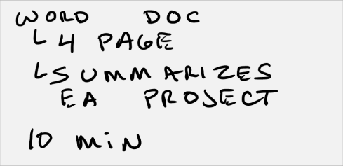
In my first Door Point (Project Status), I am going to have the team read a short 4 page Word doc handout that summarizes the overall status of the team.  I also am creating PowerPoint slides to keep the meeting on track.

The first slide will be this one, which I will put up when I give out the handouts.

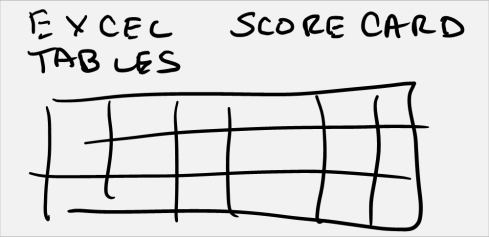
Then I do separate graphics for the proposed Word Doc and supporting Excel tables that they will be reading.

And then slides to help frame the ensuing status discussion for when they get done with the handout.

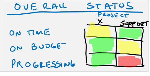
Here is overall status slide.

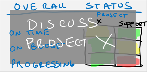
Then the slide I will have up while we discuss Project X.

Then the slide I will have up when we discuss the support project.  Now you will notice that I am not putting a ton of detail into the slides.  They will have the detailed in front of them in the Word doc and the slides are simply here to frame the discussion.  There is the added advantage that the audience members have a hard copy to write their thoughts on. 

When I am done with all the graphics each 3 x 5 card now has a textual description of what I am trying to accomplish along with any supporting graphics, documentation, and data tables roughly outlined.

My storyboard now looks like this.


Pay Attention To Transitions & Time

Take a step back and look at the overall flow and also the graphics.  Look at it through the eyes of the audience and ask yourself the two most important questions for any presentations.  First, does the presentation accomplish what you want?  In this case I would say yes.  The purpose of this presentation is to get a clear team status.  In this case, I have done that on both the project side of the house and the team side of the house.  Check!  Also, my overall flow goers from highest priority to least priority so I know if we fall behind, we will at least get through the critical content.

The second question is whether or not you are meeting the audience needs/wants.

  1. Was this an efficient use of time?  I think so.  One tip is to assign x minutes to each door point and then take a look at how long the overall presentation is.  Remember, the goal is to completely cover each topic AND end early if possible.
  2. Was there ample room for discussion?  Yes.  In the first and third door point section there is discussion scheduled.


Before I move off of this, I might consider adding an agenda handout or slide so that I can set everyone’s expectation on what subjects we will cover and how long we will spend on each. 

 Add the Hook, Stories, Demos, and Props

Now one thing that I try to do with every presentation, even a staff meeting, is add some excitement and sizzle.  Now that I have a coherent story to tell, we can add the elements that will help galvanize and keep an audience’s attention.  I usually think in terms of the Hook, what supporting Stories I can tell, whether or not an actual Demo may help, and what Props might help.

The Hook is a rhetorical or visual device that you can add right out of the gate that is surprising to the audience.  One tried and true one that I use whenever I run a first staff meeting with a new team is to announce that I want to get the meeting done early every time.  This usually makes everyone sit up a little straighter as they want to get out of the room as fast as possible and they don’t often hear the meeting leader say that they want the same thing. 

Another example of a hook might be a surprising fact or statistic.  It might be good.  “Do you know that Project X is 25% ahead of schedule right now?”  Or it might be bad.  “Project X is blocked by A and I think we can get this back on track right here”.  Regardless, saying something to get the audience’s attention and make them a participant right out of the gate is the purpose of the hook.

Stories, demos, and props can be sprinkled throughout to bring things to life.

  • Stories – Talk about real life examples.  In staff meetings I like to bring the voice of the real world into the discussion.  Let me tell you the story about how this issue that is holding up part of Project X is slowing everyone down until we can get it fixed.  “Joe Smith from engineering was….” 
  • Demos – When I used to work in R&D I would often show off a problem in a staff meeting.  “Here let me show how this one bug actually shows up in this feature”.  This would then be followed by an actual demonstration.  The opposite is also true for something that works right.  “Let me show you how cool this thing is”. 
  • Props – There is nothing wrong with show and tell.  Bring in the latest version of the product and let people play with it. 


All of these are great ways to keep the audience engaged and present as you work through any type of presentations.  You’ll hear a lot more in this in future posts.

Summary

So that’s storyboarding.  From start to finish today, it took me less than an hour to do this storyboard.  Now clearly I’m no artist, but I still do this step because it gives me a great sense of overall flow and the visual impact at every step of that flow.  Human’s dominant sense is vision and I storyboard to play directly to the dominant sense.   Storyboarding also lets me look at my entire story structure at a glance.  This is a huge advantage over a text outline!

One last note.  At this point in the process I still haven’t opened up any software.  In fact, everything I’ve done so far was done with a whiteboard, sticky notes, 3 x 5 cards, and some writing tools.

As always, I welcome your emails and comments.  Thanks for tuning in.

DK

mailto:dkarle@microsoft.com


Visualization Checklist


Whew, I know that was a lot of content.  But, Visualization does not have to take much time to do.  To help you walk through it, here is a simple checklist that I fill out anytime I have a presentation to do.


It is simple and walks you through each of the Visualization steps.  It also includes a sample workback schedule.

Ping me back on email and let me know how well it works for you.

DK

mailto:dkarle@microsoft.com

Visualization Checklist


How to Visualize a Great Presentation – Part Two: The Presentation Spectrum


Today, we’ll cover the second part of Visualization which is how the presenter decides what type of presentation they are giving. 

Have you ever sat through a presentation and wondered, what’s the point?  Felt as though the basic premise of the presentation is flawed and poorly thought out?  One of the chief reasons this happens is that the presenter did not decide what action they are trying to drive with the audience.  And so the presentation is not put together in a cogent way that that engages the audience. 


Three Types Of Presentations

I’m going to take a bunch of heat for this next statement but it is a critical underpinning of the Modern Presentation Method.  There are only three types of presentations that are ever given.  They are Pitching, Organizing, and Teaching presentations.  And each is very different.  Here they are:


Pitching

These are the traditional presentations that so many people think of.  A single presenter stands before an audience of hundreds, thousands, or perhaps just one and pitches his or her product or message.  The goal of the presentation is to activate the audience so they perform some action.  Most of the time that action is either to buy a product or to buy into a certain message. 

This presentation type is very well understood today and some of the giants among presentation experts such as Nancy Duarte and Garr Reynolds have really moved the state of the art forward with their theories.

Examples:  Advertising, sales presentations, marketing presentations, political speeches.


Organizing

The least understood type of presenting is Organizing.  There is not much in the way of literature on this and this will be a big focus of MPM.

Here, the presenter tries to create unified collective action from a team or organization.  If you look back at the Part One post from yesterday, I asked you to define your needs/wants for a presentation and gave you four ways to do that:  Observe/Inform/Status, Orient, Act/Mission, and Decision.

These four action sets map very neatly into what happens in an organizing presentation.

  1. Observe / Inform / Status – The goal is to inform a group about what is happening in a particular situation.  “Right now our situation is X”.
    Example:  Status or Staff Meeting
  2. Orient – The goal is drive consensus on what the “truth” of a situation is.  “We all agree that X is caused by Y”.
    Example:  Staff Meeting Issue Follow Up
  3. Decision – The goal is to drive a decision.  Sometimes this decision is the right of a leadership team or individual and sometimes the decision is a group decision.  That is more about how the organization vests decisions making authority than it is about the presentation type.  “Here is how we are going to solve Y and we need to choose from Courses of Action 1, 2, or 3”.
    Example:  Meeting on solving a specific problem.
  4. Act / Mission – The goal is to coordinate action.  Here, the presenter wants to get the team on board and coordinated as they prepare to go execute on some project or plan.  “Now that we have chosen Course of Action 3, here is what each team needs to go do”.
    Example:  All Hands Team Meeting

 Note:  For the management junkies out there, this is an OODA loop, which is a competitive decision making process pioneered by John Boyd back in the 1960’s and 1970’s.  More on this in later posts.


 Briefing versus Meeting

Before we leave organizing I wanted to make a special distinction between conducting an organizing presentation as part of a briefing or as part of a meeting.

Many organizations are consensus based in today’s world and as such when teams get together they meet and collectively reach a decision.  Ultimate decision making power may rest with one individual but generally everyone in the room is involved in the discussion.  Therefore the presentation must encourage and enhance this discussion.

There are also many other types of organizations that use a briefing culture.  This is where a team or a staff meet and come up with the content and then one person or persons brief a more senior person who then either makes the decision or drives the discussion.  Two notable examples would be the US Army and also the Senior Management and/or Board of Directors of most major corporations.

In the Army case, a staff or subordinate officers will be tasked with driving a particular briefing (Observe / Inform / Status, Orient, Decision, Act / Mission) and they will then come in and deliver that presentation to the commanding officer of the unit who will then presumably make a decision based on the content of the briefing. 

In the Board of Directors case, the same thing happens.  A senior executive will be tasked with appearing before the board and presenting a particular briefing generally on a hot topic of major importance (Observe / Inform / Status, Orient, Decision, Act / Mission) and then the Board will take the information and meet to make whatever decision they are trying to drive.

Regardless, a briefing is a one:few presentation that is often not accompanied with a robust back and forth.  Oftentimes the briefer will be allowed to go through the content very quickly and will simply be asked some pointed questions about the content. 

Best Practice:  Really good presenters almost always send a pre-brief in Word or PowerPoint format for the senior leaders to read in detail beforehand.  They then come in and give a short and tight presentation followed by a rich Q&A as the senior leadership has had some time to ruminate on the presentation beforehand and they generally prepare questions accordingly.


Teaching

The last presentation type is teaching.  The goal here is transfer knowledge to the students in the audience, spur their creative thinking, and give them the skills to help expand the body of knowledge through their future work. 


Don’t Mix Them Up

Now that we have defined the types I’m going to give the single most important piece of advice about them which is DON’T MIX THEM UP.  A single presentation should only be one type.  Period!

Why?  Because you will fail to drive the type of action you want if you do this.  Here are some examples:

  • Pitching To An Organization In A Decision Presentation – This is simply the most common mistake I see.  The presenter’s job is to come back to a group and do a decision presentation.  Whether it’s a briefing or a meeting does not matter.  What does matter is that the presenter chooses to pitch rather than actually delve into all of the potential courses of action. 
    So the presenter comes in, already has his or her favorite course of action, and simply presents to that conclusion rather than laying out all available courses of action for a cogent decision by the stakeholders.  Eduard Tufte, one of our fiercest critics, makes this one of his cornerstone pillars when he talks about PowerPoint but I fear the good professor misses the point.  It is not the tool causing the problem, but rather the intention of the presenter.  I have a strong feeling that this particular problem is one of the root causes for the problems that the US Army has been having with PowerPoint as of late.
  • Pitching Instead Of Teaching – Here is another common error.  In the course of teaching students, a professor or instructor fails to convey all of the facts.  Again, another point that Tufte extols and he calls it “cherry picking”.  In this case the good professor is right on.  A good instructor never cherry picks and doesn’t present a skewed set of facts.  This is purely intellectual laziness at its best and outright fraud at its worst.
  • Mixing Observe and Orient in an Organizing Presentation– This is a subtle problem but one that has huge consequences.  In an Observation presentation the goal is to bring to light the status of a particular situation.  “Our sales for Q1 are this in categories 1 through 30”.  This is very different from understanding and Orienting on what is causing sales to be up or down in categories 1 through 30.
    Many teams will try to get together and do both actions in a single briefing and they often fail.  This is because it is often easy to get the status data but it is hard to find the underlying causes of what caused a particular situation to arise.  So the team spends most of its time talking about the status and makes half-baked decisions about the underlying causes.  Once the logic of a situation is corrupted oftentimes Groupthink creeps in and the poorly thought out assumptions become organizationally recognized “facts” that later decisions are based on.  This is bad, bad stuff as it leads to bad follow on decisions.

Best Practice:  When I run a major project, I almost always separate these into two separate meetings.  In the first, we look at our status and decide what we need more info on.  In the second, we come together and talk through what our fact finding has uncovered about what caused each particular issue.  This simple process is one of the best ways to avoid Groupthink because it imposes a rigorous review process on what the particular “truth” is of a single situation.


Which Type Is Most Common?

One of the reasons I’m spending so much time on the Presentations Spectrum and the three types of presentations is because I believe one of the core problems in the current state of the art on presenting is that it is skewed so heavily to Pitching and away from the other two types.  I believe there are far more Organizing and Teaching presentations every day than there are Pitching Presentations which means we really need to move the dial to help those presenters for whom there isn’t a great deal of material to learn from.

If you don’t believe me, go look at your work calendar and see how many of each type of presentation you have had over the last two weeks.  I looked at mine and it was about 8:1:1 for Organizing:Pitching:Teaching.  And about fifty percent of my job is Pitching! 

On its face it wouldn’t surprise me if sixty plus percent of all presentations that happen each day are Organizing, and the remainder split between Pitching and Teaching.  More on this later in the posts on how to Build and Refine.

 Here’s a quick summary of each presentation type along with their various stengths and weaknesses.


Summary

Later on in the Build and Refine process I will talk about how to build specifically to each of the three types.  The purpose of today’s post is to introduce the Presentation Spectrum so that during the Visualization Process you can pick which particular presentation type you plan to give based on what actions you want the audience to take and what your goal is.

  1. Decide your goal first.
  2. Determine what you want the audience to do.
  3. Pick your presentation type.

Tomorrow I will introduce the remaining steps of Visualization.  Thanks for tuning in.

Have a good day. 

DK

mailto:dkarle@microsoft.com